The rooms were put together by Shannon Bower.

I thought oh well, I'm sure one of my esteemed cohorts have surely blogged on these beautiful rooms already, and that all of the gentle readership (that be you guys) has already oohed and ahed over this uber example of a Swedish inspired design.

So erring on the side of redundancy, I thought I'd put these photos of my blog, which I also use as an archive of photographs and images I like. Fancy that! The blog has become another clipping file, one much neater and compact. So if I'm boring you with this almost sure to be rerun, I apologize.

Why oh why does the pale room, so feminine, so hard to keep clean (all those who say it isn't are fibbing a little) tug at the heartstrings of decor lovers everywhere? Whole industries, design careers, and blogs are dedicated to this palette.

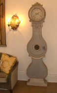
For most of us, it is a style that is a bit out of reach for many reasons. It requires antiques that haven't been knocked off at Target yet. The Swedish store for the masses, our dear Ikea, only addresses contemporary Swedish style. I wish they'd produce some girly settees and an affordable adorable Mora clock for us to have.

Also all those shades of white kind of scares us, in terms of muddy feet, hand prints and scribbles, spilt red wine, dog hair. We love to look at it all in pretty pictures, but few of us venture into its reality on our day to day basis.

Or we compromise a little, maybe venturing into having white slipcovers that are washable, but still require effort. Wrestling slips on and off the couch is a chore no matter how breezy we act about it. And not all stains or spills wash out no matter how much bleach you use. In fact I once created a very nice bleach burn on a white slip, a nice little hole smack dab in the middle of the couch.

I myself substituted white slips with upholstered faux white leather on my settee and my sofa and dining chairs, and so fair so good, though our darling grandchild aged two, managed to get a cute little hand print of something dark on one dining chair that granny cannot completely scrub away. There's a faint little shadow smudge, his tender calling card that I have learned to live with and love.

Shannon Bowers says these rooms are casual and family friendly. I'd like to ask her husband about that when he plops down to watch the big flat screen TV and put his feet up on the white ottoman or on a delicate French style table. Many ladies have a family room at the ready, and the sweet vignettes in the living room are there for their souls, for their spirits, something to look at and to use to feel refreshed and soothed and accomlplished, and oh yes a good room occasionally to sit in and spy on the neighbors.
 My own living room has evolved into a girly salon. White furniture, a glass top coffee table, etc.
The hubs chose a linen and damask print chaise as his chair, but really he hardly ventures into this room even though the largest TV is here. Our antique house has not been gutted to remake it into configurations that eschew family rooms. We have parlors. One is my girly salon, and the other is used for our dance studio. I use the living room everyday, ensconced on the chaise abandoned by the hubs, working on my lap top and watching HGTV, Cholo snuggled into the beige fake fur throw draped over my lap. This room is not that precious really. There are dog bones and dog toys strewn about, and dog hair aplenty too until I feel like vacuuming. Any mess can be cleaned up.

Alberto is the most comfy holed up in his office where he has three computers, a nice medium size flat screen, two wing chairs, a sofa, and his mess that he is comfortable with. As two who have had our business dealings at home for the past 15 years, it's nice that we vanish into our respective caves, and come together later in the day. Sometimes I visit his domain, and sometimes he'll come to claim the chaise in my salon. And we always have our bedroom for shared naps, reading, TV watching, sleeping and the rest.
So there you have it. A rerun I'm sure you could watch again. It will be here awaiting you in the vamp vault.
PS With everyone cutting corners, I have also cut back on buying a ton of magazines every month. But I just want you to know that the current issue (March) of Veranda is super good and worth a little splurge (sadly I have also cut back on subscriptions and only buy good issues now). I especially love the editorial called "A New Attitude".



.jpg)















20 comments:
The rooms are lovely, but honestly, I am so sick of this pale palette with all the plain fabrics. They just opened a new upscale consignment store on Canal Blvd. and it's more of the same: all the wood is painted gray or white or both or limed, and it's nothing but muted taupes and beiges and washed out blue with sisal everywhere. As much as I love natural linens and cottons and burlap, I'm ready for velvets and paisleys and stripes. I have to say I really loved (with a few minor alterations) candice bergen's french house from the 80s, and cringed on the inside as I imagine it has prbobably been remodeled into the same old swedish, french, belgian mishmash that's everywhere today. it's a beautiful look, but it's a little boring and it's very difficult to maintain...no matter what anyone says, natural fiber rugs stain and wear out rather quickly, especially if you have pet, white slipcovers are high maintenance, and while I know they are styled for magazines and don't really reflect day to day life, most of these rooms would be ruined by the introduction of any daily flotsam and jetsum...I personally like rooms where a couple of spare magazines, an ugly, but sentiment laded knick knack or two, and a couple of red wine stains enhance, rather than ruin, the complete effect. However, since the addition of a large dog, two cats, and a messy spouse have turned my home into what looks like to the untrained eye like a crack den, perhaps I am just eating some sour grapes.
Boring - not one bit. And as Design Junkie said, they could do with a little bit of roughing up. xv
Not sick of it
Not bored
Of course the hole was in the middle of the couch slip - where else would it be? :)
Isn't it great though that our blog archives remain pristine for ever?
You know, I love elements of this style and don't mind touches of it in a room. But I agree with you 100% about livability! I have two bouncy, messmaking Boxers and a Rat Terrier. I'm always trying to reconcile the serene, pale furnishings that abound lately with my real life. I'm always thinking, "Well that would be nice, but..."
I will say my seagrass rugs have unified my rooms and are tough and have held up to the dogs (and the occasional accident) for nearly three years. And if you are stuck with randomly inherited brown 'antique' dining room chairs, then slipcovers in washable faux linen intended for fashion (get the look without the work from JoAnn) can add a taste of Swedish style without going overboard.
So a little here and there - don't desaturate the entire home - and enjoy color! We can't live in a gallery of interior design. And here in New Orleans, we love to mix it all up!
I think that there are just some things with which I will never be done and this is it! I looked back through my "favorites file" and as far back as I can trace I have been drawn to this color palette. I even have some pages torn from a magazine I bought in Stockholm at least 25 years ago! Don't read a word of Swedish, but boy can I read pictures!
Thanks so much for the post.
PS I wonder if it is blue-eyed blonds who go for this color palette and the raven haired brown eyes that thrill at the harvest and deep jewel colors? Just a thought........Mr. Town and I had that same conversation a long time ago.
I think these interiors are beautiful to look at, but almost too museum like and yes, washed out. Living with these spaces must take a lot of work and self-control. Also, what ever happened to the bright reds and blues also associated with Scandinavian style?
I think the rooms are beautiful - though I do agree they look staged. I would like more artwork on the walls and a bit more color -perhaps a wool rug versus sisal. But I like the lack of pattern and strong colors; I find it soothing and timeless.
I have never seen most of these pictures, and my heart truly leapt when I saw the first one on this post! I love a neutral palette, although I tend to love neutral and timeless like Gerrie Bremmerman rather than strict Swedish style. But, I do love a good Swedish style room!
When I first saw my house in Atlanta, I absolutely fell in love with the light pickled oak floors and have never refinished them (despite the fact that they were very unfashionable for many, many years). They are great - truly show no dirt, and we have a light colored golden retriever so the tumbleweeds of fur aren't so obvious.
When I 'redecorated' when moving the Atlanta 12 years ago, I looked and looked for the limed finish furniture, painted chests, and so on. I was new to Atlanta, and didn't know where to look, but I don't think I would have found it back in '97. I ended up doing a lot of French country in walnut colors, because I like the style, but I will probably paint them when I move on to my next house.
I do wonder, though, how we will feel about all of this light and neutral in a few years. Once people start commenting on the trend, questioning the trend, it seems like the trend's time is up.
While I do appreciate this style and think it is beautiful, it is not my aesthetic at all. I like colors and patterns and Swedish interiors tend to look a little formal and sterile for my taste. Having said that, I am 27, so my home looks polished, but not formal. I don't have children yet, but if my house consisted of nothing but white slipcovered furniture combined with my OCD ways, it would be a total nightmare.
The other thing is, we see SO much of this in Houston. Everywhere you go, it's either French or Swedish. I'm ready to see something different. Just my two cents. :)
I'm not bored with it. I think it's very feminine. It's not my personal style, which changes based on where I'm living. I do enjoy it when a client asks for it. Tuscan is another story altogether.
Haven't seen them either...I don't think.
I think they make for lovely photos...but, like you said...a bit unrealistic in real life.
I will tell you that slipcovers in a rough linen are much more forgiving than white...any day of the week.
The style is still lovely to me...but wonder how long it will be before it does turn up on targets shelves???
I am still loving it but in my own home I have used instead creams and sand colors which give me the soothing neutral palette I love. I just find it so relaxing to live with. In an adjoining area, I have some touches of sage and darker woods, but it all seems to flow nicely. My compromise, I guess. I still would love to have a beach house someday with all whites and pale blues.
What a great discussion!
And I thougt this would be a pokey little post with the usual drooling at decor porn ha ha.
Keep it going!
You guys are the trendsetters, and definetly forecast the turning tide, as well as creating what's next.
As ever, thanks for reading and commenting!
xo xo
*** Call me "crazy", but I STILL adore this look (the softness of "no colors", & lack of "distractions" brings peace & joy to my mind a-n-d heart)!!! And actually, MOST of us, IMHO anyway, can appreciate just about ANY style approach, if DONE WELL & not "OVERdone"! You commented about why these interiors "tug at our heartstrings", & I suspect you already answered it ~~~ it's what most of us REALIZE we just "can't" (I say this w/ great reservation) "have"~~~ it's simply toooo impractical (or in MY case, maybe I'm too "lazy" to maintain white slipcovers, having a hunting dog as "our baby"!). SO, instead, we keep it in our minds n' hearts, love & enjoy it when we see it, THEN continue on w/ what we CAN create, live with and realistically ENJOY! This was a FAB BLOG TODAY, & soooo FUN~~~~MANY, MANY THANKS for the delicious pics AND the terriffic writing!!! Most warmly, Linda in AZ/ RMS "Mom of a German Shorthair"
this is one of my favorite houses - did you scan the pictures? do you have bigger images you could email me por favor!! my scanner is not set up - this truly is one of my favorite houses. I adore it!!!! email me asap!!!!! you know about what!!!
I, too, wonder if everyone is going to be sick of this crazy fettish everyone has with this style right now. The same goes for white kitchens (a.k.a. "the somethings gotta give kitchen"). I like the subtle hues of Swedish design, but I think I might get bored with it after a few years. Of course, I get bored with most things after a year or two (that's the designer in me - yikes!).
I sware, that I must have a smidge of Scandanavian blood because I love the smorgasbord of pickled herring in cream served on a pretty white plate....in one of those rooms. So pretty, non?
I live in a sea of white, it is never boring and always changing. The swedish look is a little too little for even me. I have 2 dogs, a lhasa, a terrier, one husband that has a cloud of dirt following him wherever he goes, a 6 year old granddaughter and twin grandsons on the way. Everything is washable and I don't mind throwing things in the laundry. I also can't live without a Magic Eraser and my own carpet shampooer but don't have to use them much.I bring in color if that is what strikes my fancy, but when I am tired of it and I do get tired of color easily, I can get rid of it. I guess after years of being a designer and exposed to too much color, sensory overload, I like to come home to a calm place where I can rest my eyes. I love your blog and love seeing your New Orleans.
I absolutely love this look (of course) and do love how antique Swedish elements are being use in even more contemporary settings now. It seems like the best of both worlds...the charm or traditional Swedish character and the practicality of contemporary components that fit into our 21st century lifestyles.
Tricia
Avolli
Oh dear me no - Never been tired of it, never will be. However, I've not gone all the way with it, not even in my last home (a little 1947 house w/hardwood floors and lots of light in a central coast town that gets fog in the summer) due to the realities already commented upon. I really don't think the look will disappear, because it seems to me it's always been there to some degree or another, just tweaked over the years.
Post a Comment