The Visual Vamp has moved, she is out of the hood and living in a glam new blog at The Visual Vamp.
What she misses the most is the nearly thousand of followers she left behind. Blogger doesn't allow her to take you all followers in the moving van. They say that YOU have to make the decision to FOLLOW her at her new blog site.
She knows that sometimes that can be a pain to do, so she is bribing you with some free Missoni!
Click HERE to visit the new blog site, then become a Follower and leave a comment saying so. One will be chosen at random and be awarded a free Missoni.
Wednesday, September 14, 2011
Thursday, July 28, 2011
The Visual Vamp Is Moving!
Ever since my blog was hijacked a few months ago, assigning me a sign in name not of my choosing, I have felt uneasy. So Alberto finally helped me move it. I haven't gone far. I am still with blogspot. I like the format and am very used to it after three years.
I could not use my original blog name because it's taken (by me!). So we just added one crucial word: THE.
So the new blog is: The Visual Vamp
I kept the Follower feature located in the right hand margin. But alas, I could not transfer my followers, so it's like starting all over again. So please follow me if you like.
We also transferred comments that had to become part of the text. If I missed someone, please leave a new comment at the new location. You can also leave it again on any post at the new location.
The new format is a little more colorful, but still very classic.
I will not be posting on this blog site, but it will remain up.
So please follow me to The Visual Vamp!
Thanks for three great years here and for reading nearly 5000 posts!!!
Labels:
Blog Milestone,
The Visual Vamp
Tuesday, July 19, 2011
Million Dollar Look
Go over to Houzz and see the collection of things I found to get the look of Mary McDonald's fab glam office HERE
Labels:
Houzz,
Mary McDonald
Friday, July 15, 2011
Sisters
I have also been busy with some freelance projects, and some changes for The Visual Vamp blog. which is as they say, "under construction".
New and frequent posts coming soon. Hang in here with me.
As part of the changes, I want to ask you guys how you feel about the "Follower" feature. Is it important to you? I appreciate every reader and follower. How would you feel if I did not include the "Follower" feature on the updated Visual Vamp blog?
PS The sisters in the photo are Lady Gaga with her sister Natali
Labels:
Blog Milestone,
Sisters
Wednesday, July 6, 2011
Hat Stack
I love stacks of hats! Stack 'em high on entry hall tables or chests! I stacked these this morning on the Union Jack armoire near our front door. Alberto painted this for me a few months ago HERE, and it has turned out to be so handy, a nifty little "coat" closet and a place to hang Cholo's leash, and for me to stack some of my huge hat collection.
I share a few images with you to inspire you to stack your hats! Send me photos to show everyone.
Monday, July 4, 2011
A Progressive Dinner Party In Three French Quarter Courtyards
So I get a Tweet a couple of months asking me if I was up for a styling job. I followed the Tweet to an email that led to phone calls that led to a most interesting job.
The premise was a progressive dinner party to take place in three French Quarter courtyards, a benefit for NOCCA (New Orleans Center for Creative Arts), in particular for the Culinary School.
Target was the generous sponsor, with the one request to use the Smith & Hawken product they sent for the party and for a photo shoot to be used for their various PR needs.
And send it they did! Over $35,000. of beautiful merchandise that the Target product designer and I chose to fit the personality of each of the three courtyards.
It was a complex and interesting project from receiving and organizing all the product in a hot New Orleans warehouse, to arranging for the home owners' things to be taken away and stored, to dealing with copious amounts of trash that all the packing materials created, and all the regular issues involved in planning a party, with everything done in triplicate!
Target and their PR team in New York were spectacular, the vendors in New Orleans impeccable, the French Quarter hosts stellar, generous, and helpful, and NOCCA was involved in the best possible ways.
It was the beginning of our record breaking heat wave in New Orleans, but that did not stop people from attending the sultry party, with nearly $60,000 raised in one night of fun for NOOCA!
Let's start with courtyard #1.
Small and charming, with the old servant's quarters balcony at my disposal. The home owners are avid collectors, and one of their collections is of copper pots and pieces in their kitchens. Target offered me product from their Smith & Hawken line, and there were many beautiful copper pieces to choose from.
I used Smith & Hawken zinc lanterns in all three homes, starting with this one, where they lined the narrow alley way that is the entrance to the courtyard. I chose to use wax battery operated candles for the whole project.
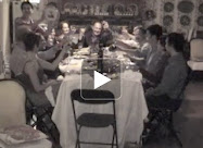
Courtyard #1 was used for cocktails and hors d'ouvres. Fifty people were invited, and 58 turned up! Obviously this courtyard is too small for that amount of people, so the house was open to guests as well.
On to courtyard #2, where dinner was served. The front entrance of each home was decorated with Smith & Hawken accessories from Target.
Courtyard #2 is long, and at first glance very large by French Quarter standards. But where do I put 50 people for dinner? I wanted this to be a seated family style dinner.
So of course! I had an acrylic pool cover installed. That's precious real estate!
I placed Smith & Hawken teak tables on top of the pool! Host chairs are also Smith & Hawken, but I could not use the teak dining chairs to accommodate 58 people, so I rented bamboo folding chairs. I wanted to use a chair with a low top line so the Target product on the table could be seen and featured. I was wearing two hats: Product Stylist and Event Decorator.
I added oversize tissue paper spheres everywhere! I chose hot spicy colors. The lovely courtyard is muted and monochromatic, and I wanted to inject a feeling of festive Summer fun by using color.
For the table: I chose to leave the tables bare, to show off the gorgeous teak wood finish. I added Thomas O'Brien dinnerware from Target, and tea towels from Dwell Studio for Target for napkins. I love mixing the sophisticated pattern and color Dwell uses. More Smith & Hawken zinc lanterns were used on the tables, and ceramic pots (also S & H) were used for bright bouquets made by Tommy's Flower Shop in the French Quarter (533 Rue St. Louis, 504 522-65630.
In another part of the courtyard, I replaced the homeowners lounge furniture with a fabulous teak set from Target.
There is an incredible terra cotta stucco wall in the courtyard, that gave me my color cue. I requested rusty orange cushions and umbrella. I mixed in navy blue accessories. I think orange and navy look so sophisticated and fresh together.
The product designer asked that I incorporate garden tools along with the planters, furniture, and another accessories. Sure thing! I knew there were all these existing metal trellises in the flower beds, so I hung the tools on each of them. I think it made for a very pretty product shot!
A ton of ginormous planters were sent for each courtyard. I didn't have the budget to buy mass amounts of plants for them. So when I could, I popped the home owner's existing plants into the planters. When that wasn't possible, I "made" plants by using a few cases of cut lemon leaves and leather leaf fern stuffed into to Oasis floral foam. These florist fillers are often maligned, but I loved them because they withstood the annihilating heat!!!!
Let's look at the courtyard again the day I went for the first walk through...
And here's the same view on the night of the party. An extra table had to be added at the last moment for extra guests coming. I always go from plan A to Z with a smile. I had to pull a couple of rental tables from other uses, and juggle the seating arrangement. I visually pulled it all together.
But wait!!!! There's still one more courtyard to go to for dessert!!!! The guests walked two doors down for more fun.
Courtyard #3 belongs to someone many of us bloggers know and love. She's my fellow "New New" as she calls us, someone from New York and New Orleans. Her home was used for dessert. Again this third courtyard is a tiny gem, so a bar was set up there, and some seating for anyone wanting some sultry romantic ambiance. So the dessert buffet done by Sucre was set up on the dining table. Do you recognize it?
I used garden ornaments from Smith & Hawken on the table: peacocks for whimsy, and mini birdbaths to hold macaroons.
Small pastel bouquets were placed around the sitting room...Tommy's did these too (and all the flowers for all three homes).
Of course I styled up the coutyard in this house too. The house is very French, so I chose things from Target accordingly.
Strings of copper shaded lights were festooned overhead, like the ones you often see in courtyards, restaurants, and even over narrow streets in Europe. Ceramic garden stools (from Target) took the place of larger furniture (and they have lights in the bottom!). Zinc lanterns were place around the courtyard. As night fell, I wanted the courtyard to twinkle, to be magical.
I had to "borrow" the linen covered table that was supposed to be the bar for the overflow of dinner guests at courtyard #2. So I used the owner's kithcen table as the bar, with a huge Smith & Hawken copper hose bowl for iced bottles of Proseco, and copper boot trays for glasses.
Whew! Just reading all this and looking at all the pictures must have worn you out!!!!
I loved every minute of this project, and I hope you enjoyed a little insight into my work world, and I hope you got some good ideas to use for your next party. Do check out Target and get some of these things. The summer sales are in full swing, and there is still alot of summer entertaining to do.
And speaking of summer entertaining, go on over to Eddie Ross and read about his backyard bash. Alberto and I went to it a year ago!!! How fast another summer has rolled along.
All photos of Art of the Feast by Valorie Hart
Except dessert buffet - photo by Sucre
Read more HERE
Monday, June 27, 2011
Two Houses Made Into One Fabulous Home
A few months ago I posted a reader's home (Kellie and Marc). It is a wonderfully designed space that we all enjoyed seeing. As I have gotten to know Kellie better, I have found out that she comes from a family of designing women.
There are four daughters (Kellie, Maggie, Sara, Jenni), each one a decor maven with one house cuter than the other, and each one looks very different in decor personality. But all share put together looks that anyone of us would love.
Knowing that my own design awareness came from my mother, I asked Kellie about her mom. And sure enough the mother of this family of designing women is the inspiration for all of the daughters.
You know I had to see Mom's house. Her name is Jill, and she has made a career out of making the family home unique and beautiful. All the daughters are grown with homes of their own, so Jill has recently made an empty nest for her and hubby Peter that all the daughters and sons-in-law and the five grandchildren love to fill.
Jill's house is unique from the get-go. She took two old falling down single shotgun houses that were on lots so narrow that you could almost touch the house next door. I love the way she used color and repetitive elements to visually join two houses together as one.
The center "bridge" addition connecting the two old houses is genius. It is meant to be the front door, but the family secret is that they all use the door on the house on the left side.The brick courtyard was made from bricks that came from fireplaces that had to be knocked out. Jill is an amazing re-cycler, and up-cycler extraordinaire.
 The "bridge" addition between the two houses
 The sitting room
The sitting room segues shotgun house style into the master bedroom and bath. This creates a master suite effect in one whole house.
 A vintage dresser and mirror in the master bedroom - perfect!
Walking through a door from the sitting room, you enter the "bridge". This is where the living room and dining area are. It is an ingenious use of space. There are French doors at both ends of the "bridge" that let in plenty of light.
There is a collection of vintage mirrors hung over the couch, which adds a reflective element that makes the narrow space expand visually. Jill has many charming groupings of collections placed around the house.
Walking across "the bridge" you enter house #2, which has two guest rooms and a bath, and the kitchen.
Each guest bedroom is furnished with sweet textiles and mementos. There is a framed shadow box with a purse in it! It belonged to Jill's mother, the girls' grandmother. They said grandmother carried that purse everyday of her life that they remember. The photo over the bed is of the grandmother.
 Love the pink and green!
 A little black cupboard in the kitchen
 ...and the old working sink
So what do you think? Have you ever seen anything more clever or more cute? It's like two dollhouses to play in!
I have been promised a house tour of the three other daughters, and I can hardly wait. I can see why all the girls love decorating and are so good at it.
Growing up with Jill, who is the resourceful and artistic visionary of the family, has created a decorating dynasty! And Peter and Marc and all the other husbands love what their designing women come up with, and lend helping hands and willing hearts.
There are four daughters (Kellie, Maggie, Sara, Jenni), each one a decor maven with one house cuter than the other, and each one looks very different in decor personality. But all share put together looks that anyone of us would love.
Knowing that my own design awareness came from my mother, I asked Kellie about her mom. And sure enough the mother of this family of designing women is the inspiration for all of the daughters.
You know I had to see Mom's house. Her name is Jill, and she has made a career out of making the family home unique and beautiful. All the daughters are grown with homes of their own, so Jill has recently made an empty nest for her and hubby Peter that all the daughters and sons-in-law and the five grandchildren love to fill.
Jill's house is unique from the get-go. She took two old falling down single shotgun houses that were on lots so narrow that you could almost touch the house next door. I love the way she used color and repetitive elements to visually join two houses together as one.
The center "bridge" addition connecting the two old houses is genius. It is meant to be the front door, but the family secret is that they all use the door on the house on the left side.The brick courtyard was made from bricks that came from fireplaces that had to be knocked out. Jill is an amazing re-cycler, and up-cycler extraordinaire.
So let's go in! The first room you come into is in house #1, and it is a precious little sitting room. Jill combines vintage and antique pieces to great effect, a classic shabby chic cottage style that is familiar and beloved.
Pale wall colors and dark wood floors work beautifully, and for the most part Jill keeps the palette soft.
Pale wall colors and dark wood floors work beautifully, and for the most part Jill keeps the palette soft.
The sitting room segues shotgun house style into the master bedroom and bath. This creates a master suite effect in one whole house.
Walking through a door from the sitting room, you enter the "bridge". This is where the living room and dining area are. It is an ingenious use of space. There are French doors at both ends of the "bridge" that let in plenty of light.
There is a collection of vintage mirrors hung over the couch, which adds a reflective element that makes the narrow space expand visually. Jill has many charming groupings of collections placed around the house.
Walking across "the bridge" you enter house #2, which has two guest rooms and a bath, and the kitchen.
Each guest bedroom is furnished with sweet textiles and mementos. There is a framed shadow box with a purse in it! It belonged to Jill's mother, the girls' grandmother. They said grandmother carried that purse everyday of her life that they remember. The photo over the bed is of the grandmother.
At the back end of the "bridge" there is an opening to the kitchen (house #2). Jill opted for a clean classic country look. White marble counter tops and painted white cabinets are a look we all love. Jill did this seven years ago. She painted one accent wall in blackboard paint so the grand kids can scribble.
Let's go out the back door to the garden! Here you can see alot of clever recycling.
So what do you think? Have you ever seen anything more clever or more cute? It's like two dollhouses to play in!
I have been promised a house tour of the three other daughters, and I can hardly wait. I can see why all the girls love decorating and are so good at it.
Growing up with Jill, who is the resourceful and artistic visionary of the family, has created a decorating dynasty! And Peter and Marc and all the other husbands love what their designing women come up with, and lend helping hands and willing hearts.
Subscribe to:
Comments (Atom)






.jpg)


