 We have all seen something in a magazine that inspires us so much that we want to try to replicate it our own homes. My imagination went on a pleasant journey courtesy of House Beautiful and Jill Brinson. Jill is an uber stylist now segueing into interior design.
I am a stylist as well. Most of my work takes place in the shop I work in. I style the displays, as well photograph merchandise for the web site, and for the shop blog I write and manage. Occasionally I do a free lance project too.
 I decided to play, to create a Brinson-like vignette. Of course I don't have the same house or colors or the same things she has. I don't have the resources to go out and buy things to replicate the Brinson magic. And I don't have the talented Rob Brinson to do the photography. But I do have imagination and talent. And my trusty digital camera ha ha.
 So I got together some things, begged and borrowed and bought on a budget, and spent a few days playing.
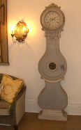
I looked for visual elements that had a similar feeling, not literal. For example, the circle of the clock filled in for the circles of the candle sconces. My little Saarinen stool filled in for Jill's ethnic one. I borrowed a higher coffee table. It's not as cool as Jill's metal one, but the scale was right. I added the antique French metal folding chair for my metal accent.
 I picked up my rug, and added my white cow hide to the floor.
I purchased some very inexpensive paisley print pillows in the same vein as Jill's , but certainly not the quality of what looked to be Les Indiennes textiles.


 I didn't have a small tray, so I used a framed photo, and an oyster shell instead of a rock. I also took the white cowhide off the floor and out of the picture all together. I traded it for the brown one - I mean I literally traded my white one for the brown one. My couch is a totally different shape and size than Jill's, but I think the general idea is conveyed.
 Next I switched to lavender accents. Again I had the throw. I switched out the pink roses for purple stock. I don't have a table lamp like the one Jill has, but my old tin floor lamp and black shade have a nice gestalt in front of the side table stacked with books. My art work above the side table is about the same scale as Jill's. The lamp and table is on the opposite side as in the HB photo, but I didn't feel the need to switch them to the other side of the couch. Again, I was not trying to copy the look directly.
 I switched out a neutral pillow for a lavender Ikat. The couch is longer than Jill's so I had to use more pillows to get the scale better. The brown pillows behind the paisley are my Ikat pillows turned to the back side.
 Jill had an apple on her table. It was brown and mine is white. My stack of books is a set of small reference books I covered with white paper and tied with twine.
 All the elements are there, but different.
 Cholo keeps me company whenever I do anything. After I styled this all up I decided that the bare floors don't work visually for the room. I also am getting back my white Saarinen coffee table! I am a cottage lady from way back so I thought this antique tea table would make me swoon, but after living with for a few days, I'm bringing back my modern edge ha ha.
 This is the room after the fantasy shoot. I put my original rug back, and my original pillows.
 I like the brown cowhide on the couch. I thought that the two cowhides would feel like Rancho Vamp, but actually they work very well together.

 Things never turn out like they look in the magazine. Still it's fun to play. I think the key is not to copy literally, but to use your own things and personality in conjunction with what inspires you.
Hope you enjoyed my little my flight of fancy.











.jpg)










34 comments:
WOW. Your Faux cover looks great!! I want to try and style my own house... I have a young kid so I usually keep most low surfaces clear.
LOVE IT!
WOW. Your Faux cover looks great!! I want to try and style my own house... I have a young kid so I usually keep most low surfaces clear.
LOVE IT!
VV or rather "Rancho Vamp"! heehee I LOVE what you did...great imagination and content!
Well done sweet friend.
xx
ps...don't you just love it when ads are place in your commentary...some people have no manners.
What a clever idea! How often I see something I like in a magazine and perhaps I implement it but to just use an inspiration to play--how come I never thought of that !!!?
AMAZING! how creative you are. i loved the pink and the black blankets the most.....
what fun you must have had.
i am so loving your blog too. will definitely continue reading....im hooked
:)
I LOVE IT - YOU are so UBER!
What an extreme compliment that you took the time to study what I did and do your fabulous twist on it - this is what life is ALL about - creating our own looks from things that inspire us -
This has made me want to do a post for you where I change the look of this sofa vignette with various elements and we all judge the results -- would that be fun? let me know! SO happy to play house anytime!
I am so flattered - thank you, UBER girl!
omg, valorie, i am sick with envy. first off - i didn't know you were as obsessed with this house as I am!!!!! I don't remember seeing a house I have just loved so much at this - the best cover in years!!! I want to do this soooo badly!!!! should I copy you???? heheh. we could have a contest and have everyone vote for the best copy - omg - i LOVE THIS!!!!!!!!!!!!!!!!!!!!!!!
you're awesome.
My favorite piece = the folding chair. Clearly, I am a girl of expensive taste. ;-P
Joni you would win! You have deeper pockets and much more experience.
Amy that folding chair is a gem - from the Paris flea market and nearly 100 years old! You have a very good eye.
And Jill, you honor me by reading and commenting.
xo xo
Valorie, I would say you have done an amazing job. I am totally impressed. I really like your last version the best with cowhide rug. Your room just is full of character. Love it!! Kathysue
Valorie-Is it real or is it Memorex? :) I love the thrill of finding an insiration picture and making it work for me. Anybody with a big pocketbook can copy...it takes talent and imagination to make it your own and you did! Loved it!
Fun idea.
Liked your cover - a lot.
that first issue is my all time fav...it has it all..
Far, far superior to the Brinson house. The Brinson photo is so "I left my heart in Cheyenne and yours is "I left my heart in (fill in the blank). Great job!
Very lovely. Very creative. Even more appealing than the original!
How fun are you!! And I am jealous of all your cow hides!
loved seeing how you went through the process, but i love the Rancho Vamp best!!
such a fun day & you've got the eye!!
xoxo,
lauren
Call me weird but I liked yours better! Also like your before and after. We're kind of a Cowboy Chic here so I loved your Rancho Vamp.
Thanks for sharing your creativeness!
I hope yor day is Blessed,
Sherry
OMGosh, I think yours definitely looks like a real magazine cover!!!!
Love the cowhide accents...not too rancho at all! Very nice!
I love you living room more! I had the best time in there at the party you had!
Would also LOVE your support on the ELLE DECOR window I did for the Big Window Challenge this year with Apartment Therapy. Check it out at http://www.bigwindowchallenge com. As we all know, AT doesn’t make it easy, but you can vote TWICE a day, once online and the other by texting “1” to 89800.
Your support means the world to me!!
Xo
Eddie
Impressive -- yours looks great - even better than your inspiration picture.
Hi Valorie,
I'm glad to see that you linked this fascinating post to Tablescape Thursday! It's a nice reminder that tablescaping is about much more than just setting attractive dinner tables.
I loved seeing your interpretation of the Brinson look. You truly captured the essence, while injecting your own unique vision.
Brava!
Bill
You are just awesome. I love what you ended up with. It's perfect. You know, next time my husband complains about me constanting moving things around I'm going to take him on a tour (via blog) to where the Visual Vamp lives so he'll understand I'm a novice at the movement of goods.
I love the way things feel when moved to a different location, even in the same room. It can make all the difference.
Hope you are well. Thanks again for putting a plug in for me this week. I've had a great week and so many new blog friends.
Have a great weekend.
How fun! I love what you did. I went to that site and it looks like it would be fun to do a cover! Great job!
Love the look and feel of the room that you styled, vintage, vampie, love it, great job...,
Excellent! You did a fabulous faux room. But why go back? I loved the look and think the coffee table looked scrumptious. I can hardly wait to do the same. You inspired us all!
Your "faux cover" looks real to me! Gorgeous. I love seeing how you played around with things and made the look your own. You are so creative!
I would be expecting a call if I were you... this looks great!
Its great to inspire...and be inspired..and if you fall inlove with an image so much so..that you want to bring it to life in your own home...then good on you !! I love it..and you did such a fantastic job of creating it..and making it your own x
I left a nicely crafted comment on this post last week, but it's gone AWOL or something. Can't remember exactly what I said, but it boiled down to "I like Rancho Vamp" best.
I had to go back and re-read--I thought the faux cover was THE cover. This was so much fun to look at the individual pieces that make up the whole, and so inspirational.
XX00
I like your room better! I think it has more style and personality, and it looks much warmer and cozier. Definitely, the room I would like to spend time in is yours!
cholo, of course, is the perfect accessory, tucked up on his smart brown and white chair!
Post a Comment