Showing posts with label Color Inspiration. Show all posts

Wednesday, March 16, 2011

Inspired News


The fabric house Kravet and Lee Jofa publish a nifty glossy publication called "inspired.news".
I get it at the shop I work in, because it's a trade publication. It is so beautiful, that I investigated how you might get it too.


The full color photos are spectacular, and the articles in this issue feature designer projects that inspire Kravet. They use established designers, and up and coming talent too. This particular issue is all about color, and they got some interesting folks to share a project that reflects their philosophy about color, and that demonstrates his or her personality about color.


In the editorial Scott Kravet tells us that he has laid eyes on millions if not billions of color. He says that he can confidently say there is no such thing as the perfect color. Do you agree?


Colorist designers Miles Redd, Diamond and Barrata, Kelly Wearstler, Todd Romano, Jonathan Adler, Allegra Hicks, Michael Weiss, Barclay Butera, and more, all have oversize large glossy photos to drool over.
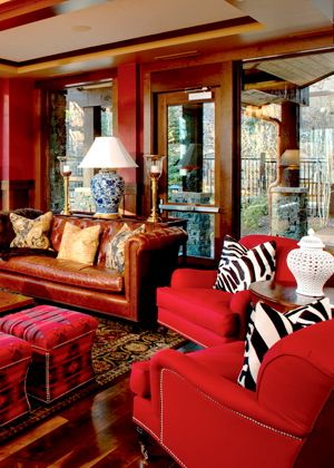
Barclay Butera


There's a Proustian style questionnaire with Vicente Wolf, and even a recipe, and a cool DIY feature about re-sizing art.


I've captured some images to share with you, but they just are not doing justice to the magazine I hold in my hands.


Diamond & Baratta


Have I made you want to get this sensational publication yet?

Contact Jennifer Powell at Kravet and tell her Valorie Hart The Visual Vamp from perch. in New Orleans sends you. Her email is:

Wednesday, October 28, 2009

The Apples and Oranges Debate


It's ANOTHER day of voting. You have to do it AGAIN TODAY. So Stop reading, come back later and PLEASE vote HERE now!

It's do or die! There are two entries left in the South, and this transplanted damn Yankee is one of them!
Let's hear a whoop whoop for New Orleans queen of the South!
But now I must get tough and compare my room against the other.

Mine(above) is truly better! Really! Step into my office. Just look at that KELLY BAG on the pouf! See the WHITE COW HIDE RUG! Aren't you swooning for those lamps with silk shades from PARIS!!! And the original Jack Mayberry painting called "Map". Of course a custom slip cover in CHARTREUSE on the comfy VINTAGE wing chair.


Theirs (above): How could a chrome lamp beat out silk lampshades from Paris. And a wire chair! Hello waffle butt! No more wire chairs ever!

Mine (below) has great book shelves styled perfectly! Check out the BRAYTON blackamoor, the antique Italian BOTANICALS, the fabulous CHANDELIER, and if you go to a larger image theres a framed photo of AUDREY HEPBURN that is a personal, family photo. And hey I got HORNS too! And TOILE!!!


Theirs (below) have book shelves too. What a yawn. And look at that hot mess of of prints hanging on the wall. It looks like my living room five years ago! You know the one that Rate My Space hated so much! And what's a kitchen stool doing there. What is that a desk? And tsk tsk all those ugly wires and cords showing. And hey, a kitty cat in the shot is playing the cute pet card. I know because I've done it myself!


Mine (below): Now this is the money shot! Look at those MAJOLICA OYSTER PLATES! That desk, a French table from FRANCE!!! A peek of silk TURQUOISE drapes! You can't see it, but the desk chair is a GHOST CHAIR! And THE COLOR!!!!!! Creole Tomato Red! Now that's hot!


Theirs (below). And what's this? A messy couch with some toss pillows?!


Mine (below): Here's my secret weapon! NEW ORLEANS GRIS GRIS! Look at that altar tucked back into the corner! Don't wreck your MOJO! Vote for New Orleans, or else I can't say what will happen! Also please note cute begonia MAJOLICA, ginormous glass HURRICANES, and a better view of the fabulous horn!


Theirs (below): I accuse my opponent of dirty tricks!!!! How dare they put a perfect living accessory is the form of a cute dog in the shot! But it can't make that fuzzy throw look good!


Mine (below) Well I have something cute and adorable too! It's my SKELETONS!!! And one of them is so adorable in his Mardi Gras mask! And Apartment Therapy featured them in a post yesterday about GOOD DESIGN Here! And look at that color on the walls, and the fireplace with a TOLE CANDELABRA over it, and more Majolica, and that arch way, and those antique chairs from Spain recovered in chic WHITE LEATHER, and oh oh oh the SUZANI tablecloth!
Seriously, all the rooms entered are as cute as can be. But please vote for mine anyway!

And listen, there is a different vote EVERYDAY. So don't think if you already voted you are done. Oh no! Apartment Therapy wants you there EVERYDAY!
So what are you going to do TODAY Wednesday October 28????

Please, pretty please...

Vote for me HERE!

Thursday, October 22, 2009

What's A Servery?

The vote is in! My Modern Creole room made it to the next round thanks to each and everyone of you! The next vote takes place on October 26, and y'all know I will give you a heads up ha ha.

In the meantime after all the color we saw at Apartment Therapy's Room For Color Contest, I thought I'd post something pale. In my search, I came across these images, and forgive me, just did a little cut and pasting today.

I guess you can say, you've been served! In a good way of course!

Thank you again my gentle readers, friends, fans, enemies, Face Book friends, family, and most of all Alberto for helping me make it through another round of voting.
That's the good news - the bad news is that you will be asked to do it again!

And now for the burning question of the day: What's a servery? Is it a made up word? No it is not! Read the official definition HERE and see more images.


From Martha Stewart: The small dining room can be accessed through the double doors in the servery. The space includes freezer drawers for storage, plus an ice maker and warming drawers for entertaining. Two dishwashers ease clean-up, and the marble floor can be vacuumed and washed with a damp mop. The wall color is matched to the cupboards, and the gentle, cool tones make a cohesive whole of many diverse features.

See how clever storage, fine materials, and surprising details make this space shine.

Martha did not want the cupboards to look like ordinary built-ins, so she designed a pair of long counters with marble tops; on one of them are glass-sided cabinets. They look so light and keep the area very airy in appearance.

Here is a view of two of the islands and the ovens behinds them, looking into the kitchen from the servery. It's where Martha sometimes has breakfast.

The office functions as a media center. There's a large-screen television for watching programs and DVDs, plus a computer, printer, and scanner for email, projects, research, and accessing recipes. Several small cubbies hold messages, paper, and supplies. At the desk, you'll also find telephones and a Sirius satellite radio.

A very well-used part of the kitchen is the cappuccino counter; there's the grand machine and two grinders -- for regular and decaffeinated beans -- for fresh grounds. On the machine, Italian cups stay warm, and everyday dishes and the like fill shelves.

Martha keeps a vintage juicer near the deep vegetable sink, where she rinses and preps produce. She has a few paper towel holders around the room, and old enamel brackets with milk-glass shelves hold kitchenware. The windows let in sunlight, which at times is tempered by translucent shades.

And one last burning question: Is a servery the same as a butler's pantry?

Saturday, September 26, 2009

Weekend Project - Take Some Pictures Of Your Home For The Apartment Therapy Room For Color Contest

You can officially enter the Apartment Therapy Room For Color Contest now by going HERE
It's fun to do! Take five photos of your room, and enter!

Come into my office! It's the most saturated color in the house.

My whole house is colorful. But you can only choose one room!


I'm hoping my office will catch their eye!

It's a hard room to photograph, and they prefer the whole picture as opposed to detail shots.


It's a viewer voting situation, so I'll let you know when and where and how to vote when I know about it, and maybe you'll throw the old vamp a bone.

If not, at least I had fun taking the photos, and doing the contest.
Let me know if you enter, and I'll get the word out for you too.

Click on images for larger views

Monday, September 21, 2009

Happy Fall Decorating!

It's officially the first day of Autumn, even though it still feels like Summer in so many places. Despite global warming, the inner clock of humans says that it's Fall. Don't you have the urge to get out your Fall clothes? Aren't you ready to do a little Fall decorating too? Or even to get out the soup recipes?


There are some things to keep in mind when using Fall colors to refresh your rooms. The first thing to remember is that a color can be considered a Fall color when you see it during the Autumn months. If you love a color that you see in nature in the Fall, then by all means be inspired to use it. Fall color is so different depending where you live. If you love a color from another region, use it! If you love the Fall color outside your door, use it! The idea is just change a little something with the season.

Another thing to think about is the fact that so many of Fall colors are on the darker side. This means that if you decide to choose the main paint color of a room as a Fall color you'll want to consider the amount of light it will take away from the room if it is a darker tone. It can create a cozy cocoon of color for the Winter months ahead. But you don't have to repaint the whole room to add a little Autumn spice.


There are lighter colors, like gold or greens, that you find in the Fall that can inspire you to use lighter colors for the majority of a space. Rather than having four walls in a room painted in all the same rich color that you find on the changing Autumn leaves, consider doing an accent wall. This way you can still get color on the walls but you can choose a lighter color for the rest of the walls and still allow the room to be bright. Keep the value of tones in mind.


There are some ways that you can incorporate Fall colors in a room that won't require you to permanently change your walls. Add new Fall color lamp shades to your lamps and/or pillows to the furniture that you have. A new area rug is another way to change the season in your room. If you have Summer sea grass, add a rug with another texture and color on top of it.


We all get a little restless with a change of season. People who love to decorate feel the urge to change something in their spaces. Curtains or drapes in Fall colors will dress up even the whitest of walls. Changing the simplest things and adding the smallest details can really make an impact.


Ready for even more color? The 2009 Apartment Therapy Color Contest is launching later this month - keep an eye out for all the details in the coming weeks! The images above are from the Southwest 2008 entries. Go HERE to see more entries from last year and to get details for the 2009 contest.

I just did a couple of little things in my living room and office to introduce some things for the change of season. I'll be posting photos in a couple of days.

Monday, March 23, 2009

White Girl


Who hasn't lived with white walls? White is so light and clean and practical. It matches everything. A couple of coats of white paint on my New York apartment walls always worked.


City life in caverns and canyons created by tall buildings is often dark, and white rooms offered luminosity.


White could be decorated any way, from modern to vintage.


The white comfort zone followed the city weary Manhattanite to their beach or country getaways. So is it any wonder that for years I thought it was "me" to have white walls?


I ventured away from those white walls a couple of times. English style had me wallpaper everything.


Before that I had a deep purple bedroom, a color that turned out to be very restful and sexy.


But once transplanted for a short time in California, I reverted back to what I had come to believe as a classic, white walls again.


For the most part, white was the way to go. Who could argue with white?
While I'm not against some white, all over white has become another story. White isn't about matching everything. It can be about being afraid of risk, experimentation, change.


When it came time to choose colors for our New Orleans house, I decided not to accept the image of myself I always had. I decided to change the recipe in this house. I wanted to be more daring. I wondered what effect other colors would have on me. Paint is cheap, a little goes along way.


White is neutral. Harmless. Safe. But color is inspiring. It's emotional. It takes you places.


And that's what your house should do. It should transport you to a place of peace and contentment.
And so what colors did I choose?


The kitchen was the first - I wanted a mustard color, something I had seen in Provence.


Next was my office. And I knew it would be red. It took a couple of tries to find the right one, which turned out to be a coral based red.


Then it was the master bedroom. I had never had a blue room, so I chose a gray blue, and it is the most pleasing restful pretty color.


The guest room got a gray beige, the most neutral color, but still some color.


The living room deep brown.


The bathrooms are white, a throwback to my old habits, as is the walk in closet, mainly to enhance the light in there, so we don't go out with mismatched clothes ha ha.


It's been four years since I dipped into the paint pot, and I am not bored with all the color. The value and saturation is similar from one color to the next, so the rooms look linked and cohesive. When people first see the house, they always remark how New Orleans it looks because of the color. I do think geography can determine color.


Painting the walls of your home makes them a part of your home rather than a generic container in which all of your stuff floats, unattached.


Color grounds you. It's an investment in your environment. It's warmer and more homey.

photos from Google Images