Like all of you, I collect images that catch my attention, sometimes me likeee, sometimes not.
So let's play together: Your thoughts please...
1. Antler sconces. I love these, even though the antler thing keeps getting played. I confess, I have antlers in my home.

2. Wall of taxidermy! I have grown accustomed to the taxidermy trend in decor, but man this is alot of head. It is a hunter's home I suspect, but no me likee so many. Actually it's a historical home HERE

3. Dem bones. I collect and use "curiosities" in my decor. I have life size skeleton charts, sea shells, specimen bugs, coral, tortoise shells, etc. This is amazing. It's from the same house as the wall o' animal heads.

4. Orange. I predict some shade of orange will be the 2012 color of the year.

5. Stripe stair runner. LOVE! Mainly because it's black and white and wiggles.

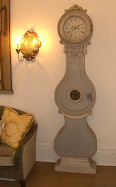
6. Big clocks. Have one. Still love it, even though they sell them in Wal Mart, Steinmart, and at the corner store. Love the low hang too.

7. Circle headboard. Looks like chair cushions stuck to the wall. LOVE. And these monograms are refreshing. Every Southern gal in these parts loves to monogram everything. I didn't get it for a long time, but I must confess I have some monograms in my house now too. I guess after eleven years of living here, something rubbed off on this damn Yankee.

So there you have the Your Thoughts Please Weekend Round Up. So? Your thoughts?
PS The April mags coming through the mail slot - so far, Elle Decor is good this month. Veranda is still finding it's pace, but still worthwhile. House Beautiful is good. Online, Lonny was pretty good too. Town and Country is really sad. Stephen lost interest for his last issue. Southern Living is consistent, best for the food features.
And Happy Weekend!








.jpg)










18 comments:
I like the striped staircase rug! that thing is so cool looking! I also think that orange and white room is pretty sweet too!
1. I like the deer head wall sconces...don't know why, but I do.
2. I'm with you on the wall of taxidermy - me no likee. It just a bit much, and I feel sad for the animals who gave their lives to decorate this house. Love the shabby staircase, though. The patina is amazing.
3. Dem bones - LOVE IT! Speaks to my morbid curiosity and dark. moody, spooky and just a little strange side.
4. Orange - the room beyond looks like the light at the end of a green tunnel. But I like it.
5. Interesting - but all the lines make my eyes wiggle. If I lived here I might feel as if I've always had too much to drink...
6. Big Clocks - meh - bet your placement is better.
7. Circles - a bit much for me, very zany late 60's early 70's mod. I'm not that sort of girl, I'm a bit more romantic, less funky. (never imagined I'd write that, but okay...)
Thanks for the query... have a good weekend.
1. Unsettling with that mirror, maybe without the eagle it might work.
2. Nightmare historic or not
3. LOVE IT
4. Orange is me.
5 NOT with bifocals - would never make it UP & an insurance claim on the DOWN
6. Good on the floor or in an unexpected spot but NOT featured
7. Happy but short lived
Happy weekend to All
Hmm. Not crazy about the animal heads or antlers. Seen too many of those in the sticks of PA. Not into bones either. As for shells and corals, as much as I do love them, as a diver, I have to say no. Like the rest of it though!
Arlene
1. Fun! Like it!
2. Too much, but in a historic or Museum setting I accept it!
3. Sometimes, where it fits, I know sounds random, but you know what I mean?
4. In small doses!
5.Grrrreat!
6.Hmm, ja, ok! (A bit riding the trendy trip) It's a free country!
7.Nice, fresh! Love it!
Live and don't fret too much over trends is my motto! Add what you like! People in general care way too much what others might think!!!!
Love this post! As always!
Hope you are doing great! Happy weekend to you both!
xoxo
Victoria
1. I like the sconces, but I think it would look better with a simpler mirror.
2. I don't mind taxidermy, but that's just way too much in one space.
3. It's interesting, but it might freak out the guests (so would #2)
4. I'm not a big orange fan, but I like the right shade of orange for an accent. I couldn't live in a room with orange walls, though.
5. I love the striped rug and the faux bois painted floor is super cool.
5. Great teenage boy room.
Michelle
the first room with the antler sconces and blue sofa is fun, but i couldn't at all live with any of that taxidermy.
i'd keep the orange for accents. the stripe rug is fun to look at, but it jumps a bit and would make going up difficult. would love to have seen that black floor paint continued up.
big dots as a headboard just seems a bit silly.
1. Love the sconces! I adore antlers in decor and this is something different.
2. eeek, this scares me! I don't mind a taxidermy or two but this is overwhelming.
3. Love the battered all, busts and the skeleton works!
but not sure about the tiger bench on the right!
4. Love orange. and with this fresh green and floral. Completely love it.
5. Stairs! I am with you, the wiggle lines are perfect.
6. great play on scale! My mum has clocks in every room large and small, they just add something to the space. And then there is me, I haven't a clock in any room! strange right.
7. adore the graphics in this room!
xx
calllie
the antler sconces were great...i think you can paint most anything black and make it work.
the menagerie of animal heads...wow! i grew up in an alabama family where all of the men (and some of the women)hunted, so dead heads hangin' on a wall used well can be as much a part of the decor as a fabulous old mirror to me...but, there's kill and there's overkill. i'm loving the madonna with child at the top left over the stairs. she looks a little shell shocked over the display.
the zigzag carpet is very, very cool, but i'm pretty sure if that were in my house i would get dizzy looking at it and fall down the stairs.
on monograms...hide yo' wives, hide yo' children, hide yo'selves..we monogram everything in the south. we love it and love it even more when it is updated and the love gets greater when it's old monogrammed stuff that is passed down.
nanne in indiana by way of alabama
and, p.s. valerie,
you are a fabulous design book waiting to happen. i cannot believe that a publishing company has not grabbed you up.
you, your blog and your projects are proof that great, innovative designs can be classic and modern at the same time. cool, domino-esque style is not relegated to the young hipster faction of the blogoshere.
i love that you have embraced the new orleans aesthetic and i almost think you have to live there or have visited frequently to truely "get it." you have had the vision to use your history in new york and other more metropolitan areas to tweak that old school n.o. way of decorating and bring it up to date without losing the creole/cajun/french/old-family-stuff-that-is-passed-down flavor that makes up crescent city style.
you are one of the faces of the new new orleans style.
thank you for sharing!
Love the B&W Stair runner. The taxidermy, not so much. XO
What I actually loved was the sofa in the first image...such sweet upholstery!
xo J~
(Mr.24's deer head had to go to his office...several miles away, the gaze was too intense. Not a huge fan although I do somehow like the third image.)
I have antlers and taxidermy in my house, and I love both. The antler thing (particularly roe deer) is overplayed at the moment. But it will pass, I think. We have a striped runner on our stair, too. Oh dear, Reggie hasn't an original thought in his head!
Reggie, you surprise me. A man of your aesthetic with antlers and taxidermy hanging out with those fine English and French antics we have all been drooling over. The next thing to happen at Darlington House will be an orange bedroom. I must see pictures. Just kidding, of course as I love your blog as I do Valerie's.
I love your blog and your opinions!
I totally agree re the magazines.
Love the bones photo!
Xoxo
Jamie Herzlinger
Love the orange, I like antlers in moderation, not in the head o walls way... the wallpaper in the orange room is freakin AMAZING. I love that its so large scale and bright. What is it?
It seems that as soon as something becomes a trend, we in blogland beat it to death. The antlers are a perfect example. I am trying to select things for our new place that aren't trendy. I'm thinking that if they aren't in style,they won't go out of style. My mother always said that good taste doesn't go out of style. By the way, can't wait to see more photos of the house you have been featuring.
First....I love the Bells of Ireland!
Those antler sconces are corny! I do like antlers, you know that! Mr. MD would love the staircase with all the 'heads'!
I like orange in small doses....it doesn't look good with my skin tone! HA!!
xo
Post a Comment