If you have been following me along on this project, you know I have been updating a house in New Orleans HERE and HERE.
You've seen the two "parlors", and the third room in this shotgun floor plan is the dining room, which I am showing you today.
As before, the owner had a lovely collection of beautiful French and English antiques. She had done up the house ten years ago, and was ready for an update.
She gave me leeway to change the furnishings. I could "toss" it all. The wall color and floors had to remain.
I wanted to keep as much as possible, and add a mix of vintage and modern pieces, a mix I am adept at using.
 The lamps were remodeled for the living room
The mirror and sideboard stayed, and the art was moved around
You can see in the reflection in the mirror the old balloon shade
It was changed to a clean tailored apricot silk Roman shade
The one huge issue in the dining room, was an off center crystal chandelier, an antique original to the house. We moved it to the living room.
The heavy Chippendale style chairs could have been painted a bright color, but I really felt that was drastic and would greatly detract from their value. They had quilted fabric slip covers that jut looked too gloomy. So the first thing we decided to change were the dining room chairs. The client loves Kartell so we started there.
 Chair tryouts
 The sea grass rug stayed - it plays back to the same one in the living room
Continuity in a shotgun house floor plan is imperative
We tried the Louis Ghost chair, The Victoria model first. The husband had a good laugh and wanted to know what doll house furniture was doing in his dining room. I had a good laugh too, and though the chair was a good starting point, I knew we could do better. Plus I like to keep the husbands happy too.
 Set of vintage Milo Baughman chairs were the final chair choice
The chandelier was moved to the living room
I found a set of vintage Milo Baughman chairs. We had been playing with mixing metals, and the chrome just seemed right. And the chairs are very substantial and comfortable, so the husband loved them.
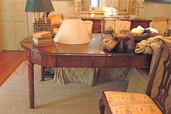
Originally I wanted to keep the antique dining table. The client proposed something modern, but everything we considered just didn't feel right. Then I saw a table in Elle Decor HERE, and it was major LOVE.
 I wanted the antique table to stay until I found this one!
It was major LOVE for the client too
The zinc metal top with the bleached root base
is a perfect sculptuaral one-of a kind piece
I chose a Kelly Wearstler fabric to recover the Baughman chairs. It is so rich in look and feel, and has a bit of a throwback to the era the chairs came from. The color wove a story with the rug in the middle parlor, and with the apricot silk drapes.
The client saw a large antler on my dining table at home, and loved it, and we got a pair for her table to try out. Other accessories include a pair of vintage Murano lamps on the sideboard, and a portrait painted by Louis St. Lewis was added to the client's formidable art collection. We kept the antique sideboard, and trumeau.
We also kept the impressive French armoire, and took all the leaves out of the dining table and used it as an accent table in the corner. A pair of Biedermeir style chairs got new seats, covered in a beautiful purple cut velvet to play off the Murano lamps.
The dining table with the leaves removed is now an accent table
I found a pair of antique metal sconces that actually felt quite modern, a good addition to the mix we had going on.
Then the key to solving the issue of the asymmetrical room proportions was delivered! We wanted to keep the ceiling medallion that the old chandelier hung under, and not do any serious rewiring for perhaps two chandeliers over the table.
Serge Mouille to the rescue!!!! With the client's love for Mid Century modern and my love for the mix, this was the only possible beautiful solution.
Frank, our electrician had never seen the lighting fixture before. I told him it was hand made for us in France, that a vintage one goes for around $35K. He was not amused, because he didn't know how to hang it. He talked about ripping out the ceiling medallion, and building a new electrical box, repainting the ceiling, etc. The client said absolutely not!
Visual Vamp to the rescue! It's not for nothing that I have been married to an electrical engineer for 16 years! So I talked Frank down from his chagrin, and gently suggested this in that, and voila! Frank installed the Mouille in record time. I love him. He crawled under the house to the sconces, and now this.
So take a peek into the dining room with the new lighting fixture... Also notice how the chairs, the Murano lamps, the art, all play back to the rug in the middle room, my color inspiration for all of the furnishings.
The family (and their friends) are just loving all the updates and changes. I love coming into these rooms every time I have something to do in this house.
I have had a great time orchestrating this fabulous mix.
Next time, I have a sweet bar area to show you, and some upstairs bedrooms I have been working on.
Sources:
Milo Baughman chairs from David Katz 504 458-1196
Murano lamps, all fabrics, antlers, white bowl with chain detail on sideboard
from perch. 504 899-2122
Serge Mouille lighting fixture from Design Within Reach New Orleans 504.891.652










.jpg)















34 comments:
I love the way you have executed your vision. Your creativity never stops. Lucky clients.
DUDE, LOOKS SO AMAZING!!!
And Mucho Mucho Gracias for the plug!!!!
Val0rie, really unbelievable transformation!
David
Oh MYYYYYYYYY Miss Val, this is INSANEly gorgeous! Wow! I am continually impressed by your talent, and am so looking forward to the day (soon) when I hit the megamillions so you can do MY little manse. Kudos; this is a stunner!
Valorie great design work and a wow transformation!!
xoxo
Karena
Art by Karena
Valorie!!!!
This rocks!!! I totally got it when I saw the rug, it is gorgeous and the mix totally works!!! I saw that table at market,,, their things are amazing and one of a kind.......Congratulations! Now I am off to go see the biginning of this redo! Maryanne xo
Sweet Bejeezus,
This is an opus.
I'm floored.
Chapeau...magnificently played.
I love the way the vaguely off-kilter vibe of non-alignment works so beautifully.
Alcira
nerochronicles.com
Valorie this is the best in design without looking designed. In every sense of the word, fabulous.
You are so damn good.
xo xo Deb
Since the owner is anonymous, could you include prices of the items you are using in these amazing rooms? I am sure I am not your only curious reader.......
Fantastic! See your train of thoughts, well done my friend! Gorgeous pieces! Love the ceiling fixture...
I love the way you have merged the design styles together in these beautiful spaces. I would think that a shotgun house is a challenge to design, and I yet it looks like it came together effortlessly (I know that's not true!) Love the coral!
I'm impressed Valorie, great job! Like MollyMarler I'm still buying those lottery tickets and when I hit the jackpot, I'm flying you in to decorate my new digs....:)
ah!!! Valerie - i love this house what you have done!!! you must be so proud. the light fixture is fabulous - everything - the table, i am in love with that!!!!!!!!!
those chairs!!
beautiful!
i hope you get tons of new clients from your work with this client.
J
Why isn't this house in a magazine? It is better than anything I have seen in a long time!!!! Bravo!
That is a pretty wild looking table! I like it!
Valorie,
The house is superb, and as you tango from room to room it just gets better with the colors going along like movements in a symphony. those Milo Baughman chairs came up great with that slightly Japanese patterned velvet which picks up from the curtains in the 2d parlor. Love it!
Hello everyone!
I love how you all get every detail! You don't miss a thing!
About prices ~ it isn't about how much money you spend. I can do this with a shop girl's salary :-) Maybe not the same furnishings, but def the same feeling.
I'll be posting a project I recently did for someone on a student budget.
My own humble home is helps gets me jobs.
I work with people of all price points.
I don't like to post prices. Even though no names are mentioned, it is not hard to figure out who owners are if you want to.
It's just polite not to talk about how other people spend money.
You can call the sources I listed,, and they will be able to guide you on prices of things they provided.
I hope you understand my thinking.
xo xo
I am really enjoying the transformation of this design project. I particularly like the balance between traditional and glam. Love the antelope runner for the staircase, absolutely unique. Is it possible to see outside shots of this house?
Alexandra
I was with you...I thought their existing table was just fine...till I saw that tree table. Isn't that awesome? I love it that you were able to keep the original table in the room as an accent table. What a challenge that off center light was. I can see why they didn't want to move it because of the plaster detail but I don't know....I think I would have gone ahead and moved it...So strange that it was off center. You've done amazing things with this house.
Valerie, is there a window in this room for curtains?
Hi Valerie - any idea what color the walls/trim are?
Thanks,
DAM
You have once again stunned me! The colors are just beautiful! Goodness gracious!!! More beautiful work, Valorie!!!
I love it! That table is absolutely stunning!
LOVING THIS MAKEOVER- YOU ARE SO TALENTED!
THE OUSHAK RUG IS A STUNNING PIECE TO WORK AROUND AND YOU HAVE DONE SO VERY SUCCESSFULLY- I STAND IN AWE OF THE FINAL RESULT.
I am absolutely sitting behind my computer screen in awe. What an amazing transformation I love how you have mixed all of the different elements. Also I did notice how all of the colors came from the rug.
Have a great weekend.
xx - CB
Oh, My. GosH. I. Am. In. Love. You are a rock star!!!!!!
OOps, I see my son has hijacked my google account!
Sally Wheat
Hi Val
I was noticing the pair of double candle light fixtures on the buffet that you said are being rebuilt for the living room. What do you think about a shield shaped lampshade, one shade that clips on both bulbs at the same time? I'm designing and making one like this for a client here and it's going to be very interesting. A more exciting lampshade than the readymade possibilities!
Best to you and congrats on your design so far. Looking forward to seeing the "finish"
Kathi
That is beautiful. I'm crazy over that antique armoire. Love it all!
xoxo
Lila Ferraro
This looks great. What a big project. I would love to see what kind of paintings you have on your walls.
Have a great week end.
~Jean
valerie,
you really are such a talent. i love how you used the bones of the room, the trumeau mirror and the rug to anchor everything and give the room a sense of age while instilling so many modern features.
again. fabulous.
nanne in indiana by way of alabama
Valorie- A just beautiful update! The cut silk velvet on linen
fabric in the chair is so wonderful!
Loretta
love the way this turned out!
Been following your blog for a while, really cool job.
Fantastic Valerie!!! You are giving me lots of inspiration here. Perfect off the Living Room as well. LOVE!
Post a Comment