 Little by little the Visual Vamp kitchen revamp progresses
I spy one upper cabinet door with chicken wire Alberto got done!
Come into my kitchen....AGAIN!
Revamp and renovations take a long time for a couple of reasons: Time and money. We are in the phase one portion, doing all the inexpensive DIY projects like painting and re-purposing things we already have. And since we have many other things to do, time plays a factor in our progress. The money portion will involve getting new counter tops and possibly base cabinets, a new sink and faucet, maybe a new microwave for over the stove to replace the old fan. Those things will come along as we have the money.
In the meantime we are already enjoying the new colors and the fresh coat of paint, and the accessories. The latest additions are the kitchen curtains!
 The accent color is black
inspired by the color of the mantle
and the antique chairs with the original finish
I was inspired by a couple of things. First my friend Mitchell from Optimism and White Paint stopped by and gave me one of his brilliant predictions: Cafe curtains are coming back! After I mocked his doily granny ways, I started to think about it. Yes cafe curtains could be good, if reinterpreted in a modern way. Mitchell is a genius!
 Whooooo helps you with your design decisions?
My list includes Michael Pelkey, Mitchell, Jack, Caroline,
Kellie & Maggie AND Alberto!
And of course all of the decor/design bloggers!
There are two windows in the kitchen, both oversize in the New Orleans way because of the high ceilings in most old homes. One of these windows would be perfect for a modern cafe curtain.
 The first window you see when you come in the kitchen
It is in the breakfast area
I "inherited" the color of the arch way and stairs
I ran with it and chose the cabinet to reference them
The second window is in the breakfast area, and is visible to the dining room where there are silk drapes. Visually I wanted to keep these rooms connected, so I knew I would do drapes on this window. Silk was too formal, so my fabric choice is off white burlap. I like burlap for budget reasons, and for texture. It can be very Belgian when left unlined, and very elegant and practical when lined. I chose to line the burlap.
 Burlap drapes in the breakfast area
The same return rod is used as in the dining room
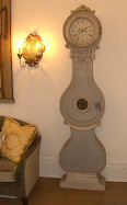
Note the black accent of the clock
The new color choice for the kitchen is what is now being called Vamp Greige since I jumped on the gray band wagon and have been using this color not only for my home, but for customer projects too. The fireplace in the breakfast area is black, and I left it that way, and hence an accent color of black naturally occurs throughout.
So when it came time to design the modern cafe curtain I was inspired by my friend Kellie HERE.
The gorgeous drapes in her front room used as an office are white with a black band along the edge. Her sister Maggie makes all of Kellie's drapes, so I asked Kellie if Maggie could do mine too.
Never let it fool you folks that it doesn't take a village for any design project. Designers never work alone. Ultimately it is your decision that you live and die by, but it is the foolish designer that doesn't welcome input from trusted colleagues during the process.
 Modern cafe curtains made by Maggie Overton
Off white burlap is lined
Black linen banding and dressmaker button detail
Maggie gave me the option of rod pocket or rings. I tried the curtains first with the rod pocket. I use pieces of cut bamboo from a neighbor's yard for curtain rods.
Notice the button "tie back" on the top tier. This was an idea I had to allow light in, and Maggie ran with it. We considered lining the curtain with a fun print, or even all black, and in the end Maggie decided to keep it clean and simple letting the lining act as another texture.
I like the pole pockets, but I wanted to try the curtains with the more traditional rings. There's something about cafe curtains and rings that just says France to me.
I had the rods and rings in my arsenal of stylist's equipment collected over the years, and just gave the rods a quick light spray paint of bronze.
The black band is yet another black accent, playing off the other black accents in the room, and I think really unifies them visually in a very chic dressmaker way.
The off white burlap is a great texture, and another neutral color that adds a tonal quality and depth. I could have gone greige in my fabric choice, but I wanted a little contrast.
Of course the rings are easier to use too, and they also play back to the rings on the pinch pleated drapes in the breakfast area.
 Visual Vamp kitchen with the modern cafe curtain
Note how the black banding references other black accents
So there you have my Monday Mini Metamorphosis! Go on over to Susan's Between Naps On The Porch HERE to see what some other bloggers are doing on Mondays there.
 Button detail on top tier of the cafe curtain
I am so honored that Maggie used vintage buttons
that belonged to her grandmother
If you would like Maggie Overby to make curtains, drapes, bedding, pillows - anything custom for your home, contact her HERE.
You can take your own measurements, and ship her the fabric, and magically you will get your beautiful finished project in the mail. Custom is not as cost prohibitive as you think, and it just adds that extra detail that all visual vamps appreciate.
PS I purchase most of my fabric for my projects from Fabric.com
They have excellent choices, the BEST prices, and friendly and very helpful customer service.










.jpg)














23 comments:
I really like the panels. And yes, cafe curtains are chic!
Like the edges trimmed in black! Tres Chic!
L.
very very chic madame!
it's a winner; love it all; lined burlap (how have i missed that!?)
trim, rings......the "peek" with vintage buttons.
xo
debra
Oui, oui, J'adore! What chic curtains - love the black edge.
pve
Burlap and black -- great combo!
those curtains are adorable.
there is a house on my walk route that i always stop to stare at...old house...prob. 1920's-30's. anyway..the windows on the top floor all have a thick plaid cafe curtain with heavy lining...it looks great from the outside.
i think it's super cool what you did with the tabs and everything.
they look fantastic. i would never have thought of the banding details. i can't wait to see the kitchen in the real.
Those cafe curtains are great! Would you share with us what the burlap fabric was that you used? Thanks!
Very sharp, job well done.
yvonne
Very sharp, job well done.
yvonne
Thanks everybody!!!
Here's the link for the burlap page at Farbic.com I used the color Ivory.
xo xo
http://www.fabric.com/SearchResults2.aspx?Source=Header&SearchText=burlap&CategoryID=1d5f47dc-9991-4088-93f3-26a376046a5e
wow! probably the first 'kitchen curtains' i've seen in a long life which weren't offensive! lovely, actually.
you do good stuff, valorie.
woof to cholo and alberto. m
michael/bagelbrookefarm
Very clever and chic solution! Love the vibe your house has and I am insanely jealous over the tall celings!
I love the curtains! I've been thinking about adding a black band to my white linen drapes (love banded drapes) in my dining room, which is actually an eat-in kitchen. Now that I've seen yours, I'm definitely going through with it!
Your kitchen is looking great! Love the colors and especially your curtains. I love that your kitchen isn't one of those "perfectly" designed kitchens. It looks "real" and comfortable. Also, very interesting and reflects its owners! Take care!
xojamilyn
Love your vision, what you are doing with your home. The kitchen appointments look very nice! The kitchen feels like it has a soul!
these curtains are fabulous.
I love the sophistication of banded curtains and you've come up with a unique way to let the light in. Love it. Our own homes are the hardest to decorate by far, and it's always nice when our designer friends help us out. Good job! to the village.
Wonderful transformation, Valorie!
Your kitchen is beautiful and so you :)
xo
Brooke
I am clapping my hands and saying "Yes! Yes!" Well done. I am SO glad to read you used burlap. Some have proclaimed it "over". But then you will have to read my post tomorrow to such proclamations. :)
Wishing I had your design team to consult with about a few projects in my home. It does indeed take a village. I think it is harder for designers because we know ALL that is out there.
Hoping your banana tree will morph into a money tree.
I am so staying at the tango B & B the next time I come to N.O.
Your kitchen has turned out absolutely wonderful V.! Its truly beautiful and has loads of charm and character...I see no "cookie cutting" what so ever! Well done!!
The curtains are great and I love the button detailing & the black...they're perfect!xo J~
Oh yes...and I think the rings look amazing...cafe curtains, especially ones like these, never go out of style, very Chanel!
Maggie rocks!
Love all your burlap drapes...especially the "corrider" shot. :) I can tell your kitchen is going to great...you're so smart to do it a little at the time. I think it makes the process that much more fun when it's all done.
i get get over the difference in your kitchen.
Post a Comment