Of the big three, House Beautiful is by far the best of them this month. Elle Decor fell flat again, and seems to really be struggling with content. Veranda fell ever flatter.
Maybe the big shake-up of moving Stephen Drucker to Town and Country, and replacing him with Newell Tucker will be good for T & C, because this the last Drucker issue is another great one in a series of them that he has been producing lately.
Veranda is getting ex Domino star Dara Caponigro at the helm of the luxury brand Veranda, though I have no issues with the stellar Leslie Newsom's excellent stewardship . I hope she is going to bigger and better projects. You just can't have a knock-out issue every month can you, and maybe this being Newsom's last issue gave it that "I'm over it" vibe.
 The cover story from House Beuatiful is girly gorgeous. You can see all the photos and read a terrific back story about at The Style Saloiniste HERE
 I was especially delighted because I have the same mid century chest that wunderkind Mellisa Warner has in her posh and pretty apartment!
I snapped a quick photo of mine for you this morning and styled it in the same vein.
I grabbed some flowering branches outside my door. They are so cool. I don't know waht they are. They look like mini passion flowers, but they are growing on a huge tree like bush instead of a vine.

 For a moment I wanted to repaint my chest! The white and blue looks so fresh.
My piece is actually three of these chests hooked together, with a long pecan wood top. I have often thought about separting them, and making three new tops so I could use each of them in a different way.
The piece is vintage Baker, and when I bought it in a thrift store years ago, no one was attributing these Baker pieces to the pedigree they are now enjoying on sites like 1stdibs.
I repainted mine, but it is still close to the original color. I aged it a bit which fits with the faded decadence that is New Orleans. I think if I painted it a slick white (with possibly lime green insets) it would not work for my room. The beautiful hardware on my piece is also not modern like Melissa's, but more baroque.

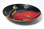
Other news is that Amanda Talley just sent off the painting to the winner of the first The Visual Vamp Giveaway.
 I think it is going to look wonderful in Kristen's space, don't you?! Amanda actually did TWO paintings for her! I thank Amanda again for her generosity!!!!
Via the giveaway, Amanda was commissioned by The Zhush to do a painting!
Contact Amanda if you would like her do one for you HERE
I hope they both post soon and show us where they are hanging their fabulous ATs!

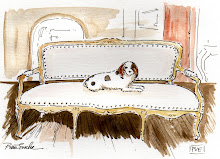
Lastly, we are dog sitting our next door neighbors' dog Coconut. She is adorable and Cholo is smitten.







.jpg)
















19 comments:
I blogged about the HB article, too! LOVE that girly space.
Happy Fest.
I will send you a pic of my AT in its place!
JSH
I just recieved my Veranda today and enjoyed it! I am really going to miss Lisa!
Love the HB cover story! was girlie beautiful, fresh and lovely!.
xx
callie
Hello Miss Vamp,
I love the dog in front he is adorable.. Cabnet looks 1000%
better white. Have a terrific weekend. Do you go to the races in New Orleans? Do they still have a track?
yvonne
I spyed! I wait every month for House Beautiful. I like the handles on the white chest, don't you?
Cholo's new friend Coconut is too cute but he is cuter!
Well, Holy musical chairs...batman! What the hell?!
Shaking head.
The chest is cool, but that painting of the dancing girl in the "Dorothy Red shoes" is wonderful. I think it would make me happy to see it every day!
The excitement of a new magazine along with each page serving as some sort of inspiration be it in a fresh coat of paint or something feminine and pretty, it is so appreciated to make changes that can not only be liberating, but also make each of us feel a certain contentment which is needed in this world.
Like our canine loves, they too love happy owners.
I think that chest of yours will love you for a fresh coat..
It would also be chic in white with a neutral taupe or even the drama of Draper Black and white, like coconut.
Enjoy each day. Saw the boys yesterday, Eddie & J, what a treat! :)
pve
the longer and slightly aged baker cabinet is marvelous. don't even think about taking it apart! just too good to split.
mlle coconut looks like fun for cholo. m
michael/bagelbrookefarm
How fun to see that pieces you own are enjoying their 15 minutes of fame. And you probably bought them for a song, which makes it all even better! I've always loved your long, long, long, console but had not realized it was in reality 3 pieces joined. I have to say that I also love the chest on its own as shown in the magazine. There's no reason you can't play around with those pieces since you're always shaking things up in your house anyway. Separate them and bring them back together as the moods and seasons move you. I would also love to see how you would re-paint your 3 cabinets, even if they're all the same color(s). You don't have to copy the bright look of the magazine version; just do a New Orleans Vamp version!
Amanda Talley's paintings for Kristin are beautiful, and I can't wait to see them hanging in their new space.
Coconut's face is so sweet! I can see that Cholo is interested in impressing her. He usually looks so dignified in his photos, but he's a bit more of a "bad boy" in this one. Just a litter rougher around the edges.
YAY!!! i can't wait to get my paintings!!!! Thanks Vamp and Amanda, you just made my day!
I think the cuttings in your vase come from a Pineapple Guayaba Bush.
I've been enchanted with the beautiful historic homes you have in New Orleans for ever and they were a great influence in the building of my own home. When I need a serious dose of inspiration...I turn to the Garden District, Perch, Lucculus and Mary Cooper( her previous home)...you all never fail me!
Thank you so much for this wonderful glimpse...and best to Albert!
xo Jessica~
House Beautiful rarely disappoints! Hope the changes there are nothing drastic! I've never been a T & C girl, and Veranda has been hit & miss! And, thrifts stores are the best, no?
Oh my goodness! First of all...my comment *here* was supposed to be in the "Behind Closed Doors 1" post and second of all...somehow the o in Alberto didn't show up! I apologize and am shocked at what one glass of wine on an empty stomach will do!
xo Jessica
Oh yes, and... pooches & chest are both adorable!
Hi Valorie-
Thank you for the shout-out for THE STYLE SALONISTE my blog.
MELISSA WARNER'S LA apartment has been so popular...and everyone is so impressed that Melissa is 30 years old. I had some lovely comments--and one dear friend referred to Melissa as a 'darling girl'. I thought that was so lovely.
The cabinet...wow, it is the same, and two totally different styles. I wonder what color Melissa's was before she painted.
Dogs are handsome and lovable. It will be hard to part with your 'dog friend'.
Cheers--tango on!
DIANE
www.thestylesaloniste.com
love this - amazing!!! funny that's smaller.
Post a Comment