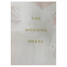
 The cover shown above is for the UK readers. It shows an all white decor that we in the USA love and replicate in droves.
 The cover for the USA shows a typical English cottage and gardens. Why do you think they chose to do that? Maybe my favorite reader from the UK, Jan, can answer the question.
I chose the rooms featured on th UK cover to show to you.

The editorial is called "Made To Measure." The lady of the house confesses that Somethings Gotta Give is her favorite movie, not only for Jack Nicholson, but for the interiors. She admits to watching it at least once a month just to see the kitchen and the dining room. She's our sister sister for sure!

She hits all the right SGG notes in her Victorian home in North Yorkshire. There are white slips, dark floors, light walls, vintage chandeliers, and light painted furniture.
 Accents include clear glass lamps, stone urns, and silver Mercury glass. She also uses fresh flowers, favoring hydrangea.
 The kitchen is very SGG, white cabinets, black counter tops. She opted for a stone tile floor. There's a vintage chandelier over the sink instead of pendant lighting.
The bedrooms have natural fiber rugs, white walls, and more vintage pieces. The whole effect is very Hamptons coastal.

The old footed tub in the bathroom is perfect. I love the rain shower head too, and wonder if the shower curtain was removed for the photo. I know many European bathrooms eschew shower curtains, letting the water run all over the bathroom. I can't imagine that happening here with that antique mahogany chest in the room.
The exterior of the house is lower left.
Can you spy the little title on each page corner? It says English Elegant ha ha.
 This magazine does not have a point and click web site. So I had to scan images for you. We have been so spoiled by being able to get images from sites! When I first started my blog, I didn't even know how to scan a photo. I was pathetic. I took photos (!) of magazine and book pages to put on the blog.
So if you like this magazine, let me know, and I'll post another editorial for you. I think the English have great decorating style.










.jpg)
















13 comments:
Gorgeous!!! love that house!
Beautiful! I very much enjoyed seeing these pictures. laurie
Wow V, what a responsibility! I'll attempt to answer without stepping on any toes!
It has been known for 'English' people to find it amusing that 'Americans' when they visit here are so fascinated by the history (much of it very very old) in this country - something we just take for granted I suppose.
Although I personally am similarly affected when I stumble across something (which happens frequently in London!)
Despite the magazine editors attempts to reinforce the stereotype, I can assure you that it's not all cottages and afternoon tea over here! But strangely I do live in a cottage (tiny and rented) and of course I drink lots of tea!
I'm just glad that you find us appealing:)
More, give me more please!
Beautiful images!! thanks for sharing!
*cockney accent*
"could I have some more, please?" lol.
great post and beautiful residence . . . I'm always fascinated by the 'cross-atlantic' marketing ploys that both US and UK businesses use for their products.
I used to work for Ralph Lauren, and those ads that felt the most 'iconic/english' in the US market were re-imagined and felt the most 'american' when the ads ran in the UK and European magazines.
thanks for posting!
Yes, yes! More please :)
Love your blog
xo Isa
Hi Valorie,
Isn't that funny that they change the covers for the demographic? Personally, I find the English cover much more appealing. I think it's their misperception of Americans, just like our misperceptions of the English. Thanks for the post. Would love to see more of the magazine!
Whiter shade of Pale. Oh, how I love it!! So why is it that I just put the second coat of a new dark brown on my bedroom walls this afternoon? Well, I just ain't over brown yet! It's still got places to take me. Also, architecture has something to do with it. Until 7 years ago we lived in a 1947 cottage with hardwood floors. White worked. Now we're trying to refresh a 1977 on a slab. The white just didn't work. Looked too "apartment-y." But maybe someday when we can add some molding or something? Now that "Something's Gotta Give" house is the dream of many a gal, including me. Sigh.
Beautiful home...I could move right in! I also love your Thursday job....next time I am in NOLA I will visit the shop. I used to live there and miss visiting all the great shops there.
Blessings!
totally wierd,
the covers i mean.
oh, CV is finally posted .
xx
It looks like a great magazine. I also love the British style. Enjoy.
Please show more of this magazine! I can't find it anywhere online and I would love to learn about Pearl Grey and see so so many more pictures! Please do show
Post a Comment