It's like playing one of those games on a paper place mat in a family style restaurant, you know, Where's Waldo?
I took the suggestion of a professional photographer to take photos of room decor using only the natural light in the room, and using a slow shutter speed. It's not as easy at it sounds, especially when using a run of the mill point and shoot digital camera. He also says to move things into the shot, that a room "as is" in real life, seldom works for a photograph.
I also pretended I was styling the room for a client paying me to do so, trying to cast a critical eye on my personal objects.
By and large, I am not happy with my living room. It is small. It has windows and/or doors on each and every of the four walls. I did not choose to paint it yellow, but rather moved into the house four years ago with this wall color, and have just worked with it due to indecision and laziness. I enjoy the yellow on many levels - it looks like a morning room, and in fact I enjoy having my morning coffee in there - the light is very lovely.
I have acquired the furniture over time, and none of it is good, or expensive. It's alot of flea market crap. The sad thing is, I will never be able to afford proper things. I am a real make-do gal. Up until recently, I thought I made-do to a great and pleasing effect, worthy of any magazine. I think I have been living under a very cozy rock.
These photos show my latest bout with restlessness and discontent. I fished the rug out of my magic closet. This is a closet filled with junk I have accumulated - lamp shades, picture frames, pillows, knick knacks, fabric, rugs, art work, small furniture - stuff that gets rotated, until I decide to toss it or sell it. I have had bare floors, a Jonathan Adler rug, a leopard rug, and a cow hide rug.
The colored toss pillows are a "new" addition too, inspired by watching the 1954 movie A Star Is Born, and my looking at a book on Tony Duquette. I recently dyed the slipcover and curtain panels pink to play off the yellow walls. I had a pair of 1970's pale flesh pink lamps in the shed out back (given to me by a 90 year old lady), and swapped out the black lampshades from the bedroom.
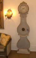
I've had the big clock and the nine foot long credenza and the two chairs (slipper and Eames) for awhile. Ditto for the Will Barnett lithograph. The wall paper mural on the door has been there since I put it there four years ago, my attempt at doing something cute with an ugly door. The chandy was put there by us (another gift from the 90 year old lady). I've had the pair of vintage tables (used as a coffee table) for a year - they can be a table or a stool, as the tops come out and reverse to a cushion or a hard surface. They were an eBay purchase. The orange Foo Dog is a recent purchase from Pier One, an attempt to add an accent color along with the orange toss pillows, and also a very Duquette touch in my mind's eye (which I'd like to poke out sometimes). The modest size flat screen came into our lives a couple of years ago so we could watch the World Cup in style.
I'm on the verge of investing what will be big bucks for us, recovering the couch in faux white leather, with nail head trim. It will cost as much as new couch. I could buy a new couch, but so far the ones in the furniture stores that we can afford are all very depressing, mostly the fat ass cushion types, or bad Pottery Barn knock-offs. I think I am over my Mid Century Modern phase, something that came upon me, as a way to make my living room look young, as if you can do such a thing to a room, like lipo or botox. So L-shape sectionals seem played out too.
Along with the re-do of the couch, I have decided to re-do the living room, i.e. get rid of the yellow, do new neutral color window treatments, get rid of the Eames chair, and try to do something with the credenza too. I want the room to NOT look like vintage vamp. I want it to look as sophisticated as I am in my mind's eye.
In the meantime, please choose one of the photos that you think looks best.

Adding two X-back chairs,I took the suggestion of a professional photographer to take photos of room decor using only the natural light in the room, and using a slow shutter speed. It's not as easy at it sounds, especially when using a run of the mill point and shoot digital camera. He also says to move things into the shot, that a room "as is" in real life, seldom works for a photograph.
I also pretended I was styling the room for a client paying me to do so, trying to cast a critical eye on my personal objects.
By and large, I am not happy with my living room. It is small. It has windows and/or doors on each and every of the four walls. I did not choose to paint it yellow, but rather moved into the house four years ago with this wall color, and have just worked with it due to indecision and laziness. I enjoy the yellow on many levels - it looks like a morning room, and in fact I enjoy having my morning coffee in there - the light is very lovely.
I have acquired the furniture over time, and none of it is good, or expensive. It's alot of flea market crap. The sad thing is, I will never be able to afford proper things. I am a real make-do gal. Up until recently, I thought I made-do to a great and pleasing effect, worthy of any magazine. I think I have been living under a very cozy rock.
These photos show my latest bout with restlessness and discontent. I fished the rug out of my magic closet. This is a closet filled with junk I have accumulated - lamp shades, picture frames, pillows, knick knacks, fabric, rugs, art work, small furniture - stuff that gets rotated, until I decide to toss it or sell it. I have had bare floors, a Jonathan Adler rug, a leopard rug, and a cow hide rug.
The colored toss pillows are a "new" addition too, inspired by watching the 1954 movie A Star Is Born, and my looking at a book on Tony Duquette. I recently dyed the slipcover and curtain panels pink to play off the yellow walls. I had a pair of 1970's pale flesh pink lamps in the shed out back (given to me by a 90 year old lady), and swapped out the black lampshades from the bedroom.
I've had the big clock and the nine foot long credenza and the two chairs (slipper and Eames) for awhile. Ditto for the Will Barnett lithograph. The wall paper mural on the door has been there since I put it there four years ago, my attempt at doing something cute with an ugly door. The chandy was put there by us (another gift from the 90 year old lady). I've had the pair of vintage tables (used as a coffee table) for a year - they can be a table or a stool, as the tops come out and reverse to a cushion or a hard surface. They were an eBay purchase. The orange Foo Dog is a recent purchase from Pier One, an attempt to add an accent color along with the orange toss pillows, and also a very Duquette touch in my mind's eye (which I'd like to poke out sometimes). The modest size flat screen came into our lives a couple of years ago so we could watch the World Cup in style.
I'm on the verge of investing what will be big bucks for us, recovering the couch in faux white leather, with nail head trim. It will cost as much as new couch. I could buy a new couch, but so far the ones in the furniture stores that we can afford are all very depressing, mostly the fat ass cushion types, or bad Pottery Barn knock-offs. I think I am over my Mid Century Modern phase, something that came upon me, as a way to make my living room look young, as if you can do such a thing to a room, like lipo or botox. So L-shape sectionals seem played out too.
Along with the re-do of the couch, I have decided to re-do the living room, i.e. get rid of the yellow, do new neutral color window treatments, get rid of the Eames chair, and try to do something with the credenza too. I want the room to NOT look like vintage vamp. I want it to look as sophisticated as I am in my mind's eye.
In the meantime, please choose one of the photos that you think looks best.

and lowering the clock; removing the VCR

Most of the room, with the hard to photograph chandelier,
and showing one of the tables with reversible cushion option -
I cheated and left the chandy light on - the unlit bulbs looked sad to me
The fan light over the door is an antique from a NOLA Creole house

Moving the chair to the left...
removing VCR and DVD player,
and keeping the table tops with the hard surface -
moved the faux fur throw...

Moving the Eames chair to the right,
where it makes no sense since it's the chair for TV viewing;
letting flat screen be seen










.jpg)













5 comments:
I love everything individually but not all of them together. The biggest thing for me would be to get rid of the rug. It confuses the style.
BTW, I love this blog and visit often.
Re do the sofa. Even though it may cost as much as a new sofa, most of the new sofas have not an ounce of the style of that camelback sofa done in faux leather. At interior fabrics on severn ave, they have an incredible white faux crocodile for less than $20/yd. I think it's $10/yd. And if you decide to do something to the credenza, I'll be happy to help if I can.
Where's the ghost chair-gone to another room? I'm not a nut for it, but I thought you really loved it. I like your room any of these ways. Like the tables as tables better than with the upholstered tops-at least where they are in the room now. If you get all sleek and neutral, will the room still feel Val-like?
I understand the need for change.
The only remotely critical comment I could make is that the pink lamps seem to want a different shade-longer perhaps?
Hello All! The ghost chair is being used in my book room as my desk chair - I love it, and will always use it somewhere. Yes the shades could be bigger, but I'm decorating out of the magic closet, so they'll have to do for now LOL Thanks for noticing all the details!
I'm posting this for nyclq who is having trouble with the google sign in process. She was nice enough to e-mail me some great advice:
hey vv: popped on here this morning and came across this post about taking photographs of a room. Some more things to try: 1. lay on the floor and shoot angled up, 2. bring a ladder into the corner of space and see what ya see, 3. have something in the forground (even if you have to hold it, like a branch with leaves) and shoot through it (it gives depth to a photo), and one of my favs for interest (and sometimes pisses peolple off), 4. just angle the camera: photo can have added drama and sometimes gives the width needed to open up the space or capture everything in the frame your trying to show....
Post a Comment